Colors of Progress is a series of design-oriented text-based flags that together culminate in a site specific art installation. These flags are designed based around a deconstructed version of the LGBTQ+ rainbow flag symbol, with each color recognizing a different marginalized group. Each flag is emblazoned with a quote from a member of that community that describes their hopes, fears, and dreams. Alone, they are each a beacon for our future and a reminder of our past. Together, they are a chorus, echoing the myriad of voices that comprise our world, calling out their struggles and rejoicing in their love and truth. The flag is one of the most powerful and universal symbols, and Colors of Progress seeks to use the intrinsic energy within them to harness it and highlight the struggles and accomplishments of these communities, as well as the lives that have been lost. Placing them in public space, it is a disruption to a complacent landscape, a reconstitution of a material that has historically served to uphold regressive notions of power changed so that it may be a site for visual discourse and dissent.
The flags take inspiration from protest signs, drawing heavily from the signs used in the Stonewall Uprising of 1969 and the National March on Washington for Lesbian and Gay Rights ten years later in 1979. Countless protest materials from the ONE Archives at USC and the Larry Kramer Archives at Yale University were gathered and examined, and their radical use of text and design is reflected in these flags. These signs relayed the most important message in a visually compelling and provocative way: LGBT rights are human rights. This message, simple but revolutionary, was transformed to a small placard, produced and reproduced and carried in the streets with the goal of freedom and equality. The flag metaphor, one that is used to powerful effect in nations and cultures across the world, becomes the optimal way to communicate this message. Usually used to denote ownership and divisiveness, it becomes recontextualized as a site of both active and passive resistance and as an art object with a voice. It is telling a new story that transcends borders and time, and elevates a community that is bigger than any boundary. The flag takes the voices of the marginalized individuals within the LGBTQ+ community and uplifts them high in the sky.
Like Jasper John’s or David Hammons’ work with American flags, Colors of Progress takes this powerful visual representation and calls into question its semiotic function. And while visual signifiers and the aesthetic of dissent has largely moved to the digital sphere, this work seeks to take up the physical space formerly held by these flags, and give that space to new voices by deriving profound meaning from its ubiquitous symbols. As Barbara Kruger does with her work Untitled (Questions), transnational power is identified and rejected. Appropriating the flag in this way seems to almost neutralize it, stripping it and using its own tactical agency against itself. Colors of Progress works to investigate the ways that this neutralization can manifest a symbol in new and more complex realities, in which a semiotic power can be replaced by a discursive visual language that is multifaceted and diverse. These are the Colors of Progress.
-Phil America
 Third Street Promenade, Santa Monica, (USA)
  Capitol Mall, Sacramento, (USA)
 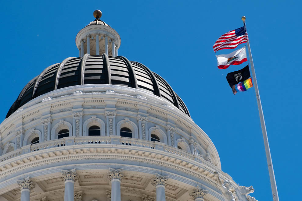 California State Capitol Building, Sacramento, (USA)
  Brooklyn Museum, Brooklyn, (USA)
 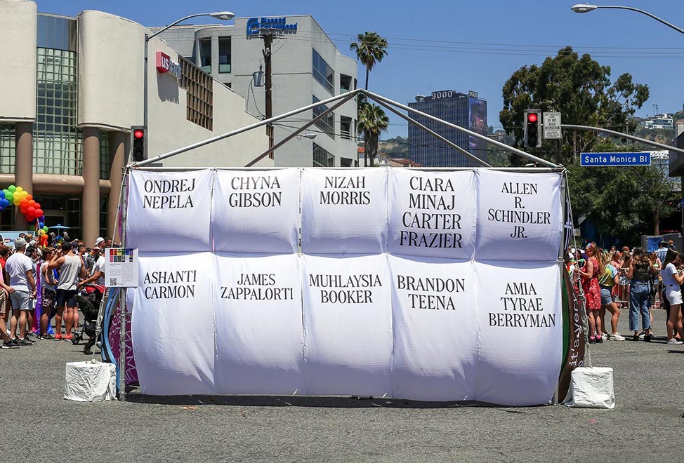 LA Pride, West Hollywood, (USA)
  LA Pride, West Hollywood, (USA)
  California Governor's Mansion, Sacramento, (USA)
  Third Street Promenade, Santa Monica, (USA)
  Third Street Promenade, Santa Monica, (USA)
 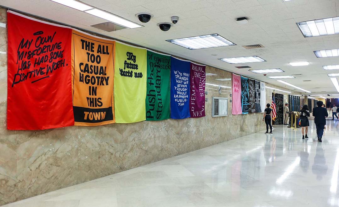 California State Governor Gavin Newsom's Office, Sacramento, (USA)
 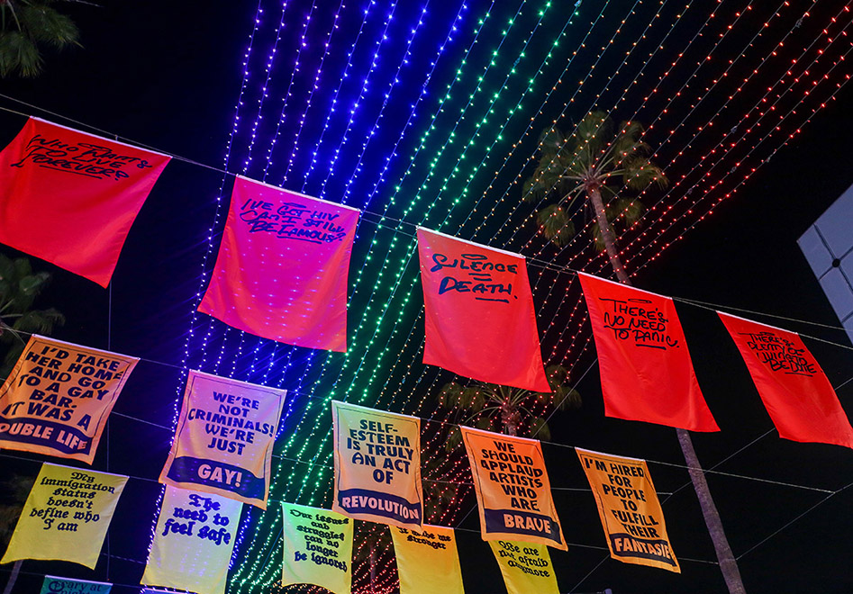 Third Street Promenade, Santa Monica, (USA)
  Artpace, San Antonio, (USA)
  SoHo House, New York, (USA)
  Los Angeles Athletic Club, Los Angeles, (USA)
  Third Street Promenade, Santa Monica, (USA)
  Des Moines Art Center, Des Moines, (USA)
  Human Rights Conference, New York City, (USA)
  California State Governor Gavin Newsom's Office, Sacramento, (USA)
  Capitol Mall, Sacramento, (USA)
  Capitol Mall, Sacramento, (USA)
  CAM Raleigh, Raleigh, (USA)
 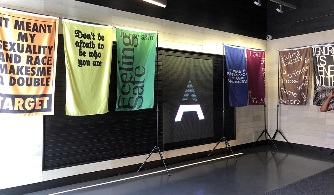 Alley, New York City, (USA)